


A post by Rob Dickey
There's more to English than the nuts and bolts of the language. As with any language, it's meaningful only in context.
Unless you are dedicated to strict-translation or the grammar-translation or audio-lingual methods, you probably use content in your language lessons. Beyond the materials offered by the textbook, where can we go? Here I'll offer an amazingly useful topic area, and provide links to useful resources.
Topic: Business Communications: How to format your paper for "western" audiences.
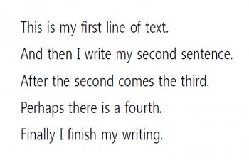
Far too often lower-skilled English language learners present their written text with each sentence starting on a new line. I haven't figured out why they do this when they don't do it in Korean! (I've asked if it was a product of a translation tradition, but students claim that not to be the case, so it seems they are simply buried in the issue of constructing accurate sentences.)
So a series of "content-based" and task-based lessons can revolve around presenting students' work in a format western audiences will expect. I generally tie this with development of a "Cover Letter." In the cover letter they will use the same types of information - perhaps many of the exact same paragraphs - that would go in the typical "Letter of Introduction" (LOI) attached to many company applications. The cover letter adds the addressing and signature format norms of common business correspondence (and these do vary), whereas most schools focus on the academic essay.
This is not a lesson on paragraph and essay composition, nor business correspondence, although those very often accompany this lesson on presentation. In a pure writing course, paragraphs and essays may well be the principal focus, but the cover-letter and page design lesson(s) can fit into any four-skills course, particularly for 3rd and 4th year university students. I am also a strong-supporter of the process-approach to writing even if that means only spending 12 minutes, once per week, on the written work.
There are at least three areas for "text presentation" to consider. Plus one more if providing "soft-copy" (electronic) submissions rather than a printout.
In this article I presume readers are regular users of MSWord.
1. First Impressions: General page formatting.
Most of the world lives in the A4 sized sheets of paper. North Americans usually expect 8.5x11" (inch) "standard" sheets. Students need to know the difference. A colored sheet of "standard," overlaying white A4, makes this obvious enough! So students need to consider page formatting. If they are working in A4, they may want to increase the bottom margin by 2cm to allow for N. American photocopies. Otherwise the standard 1" (2.54cm) margins top, bottom, left and right are probably best. Do note that many Korean versions of MSWord, along with the popular HWP and other Korean wordprocessors often default to 3cm top and bottom margins.
![]()
Instructions for re-setting page formatting in HWP can be found here. It is important to remember that in HWP headers and footers are ON by default, and spacing for these is ADDED to the margins, unlike MSWord where headers/footers are inserted within the margins. (This link also includes information on line-spacing, type-sizing, etc. for HWP.)
2. Looking Closer: Type-sizes, Fonts, and Line- and paragraph-spacing
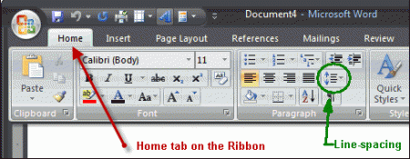
Koreans seem to favor smaller type sizes. And I'm getting older. What many don't realize is that type-style (generally known as "font") affects readability and apparent type-size. Font also affect line spacing, transferability of the document between computers, and can impact soft-copy production as well. Most of the relevant controls can be found on the Home tab in the latest versions of MSWord.
(a) Type-size. 10 point is roughly the same as the old (ancient?) 12-pitch on typewriters - that is, 12 fixed-width characters per inch. 12 point is roughly 10-pitch, nearly 20% larger in height, width, and weight (thickness of the lines in the image). Note that bold does not increase size, it only increases weight - more ink for that character.
(b) Font. Generally, only one or two fonts should be included in any given business correspondence. A serif-font (one with "feet"), such as Times/New Times Roman, is most preferred. The traditional argument is that this style makes it easier to track a line across the page. Times/New Times Roman is the traditional business font. A sans-serif font, such as Arial or Helvetica, is more common for headlines, image captions, and footnotes. Often these fonts compress horizontally better (you can squeeze the line for a couple more letters). Fixed-width fonts, such as Courier, allows each character to be aligned perfectly, whereas in others an "i" is a narrow letter and a "w" requires nearly three times more space. Italics and bold are complements of fonts, and may not be available in all fonts. Font can also affects line-spacing, as some are designed for added white-space above and below the tallest characters in the set (even if you don't use those characters). This is particularly true of Korean fonts, since Hangul includes three stages (levels) in many written syllables.
(c) Line-spacing. Line-spacing in most wordprocessing software is generally designed to modify the line-spacing set in the font. But it depends. MSWord has three sets of options, and which version of MSWord will affect which options are presented (and in which order). Generally "single-space" presentation is preferred unless an employer asks differently! So the easiest way o control the presentation is to set line-spacing as "Exactly" at the same number as the type-size. A quick-help is here.
(d) Paragraph-spacing. A separate but related issue is the gap between paragraphs. This is most often set as either a factor of the currently-set line-spacing, or a fixed distance. The general rule for text documents (not online documents) is to not set special spacing for paragraphs, but to double-space between paragraphs by adding a single blank line. However, when data is copy-pasted from other documents (particularly online documents), special formatting is often carried in and must be adjusted. Note also that one tradition in page formatting is to indent paragraphs but not double-space between them: this can be a decision based on space available.
3. Accuracy: Spell-check and Grammar-check
Errors detract from presentation. Aside from language classroom considerations, these cover letters / letters of introduction often serve as a demonstration of language proficiency: errors must be minimized. Some of this - the mechanics of language - can be done by the wordprocessor. MSWord has a brilliant grammar-checker. It's not perfect, but what is brilliant is that it can be set for various types of language - not just English, not just British English (BrE) or American English (AmE), but academic English or casual prose or...
- Do you prefer your Oxford Comma?
- Punctuation inside the quotes, or outside?
See more about how to set these (with illustrations).
4. Submission: Hard and Soft-copies
Some students are simply amazed to discover that the world doesn't read HWP. This is less a problem today. MSWord suffers from a different challenge -- a document developed on one machine can look quite different on another. The most widely adopted solution is PDF. Many newer versions of HWP and MSWord (or OpenOffice and other MSWord-similar wordprocessing software) can produce PDF documents. Alternatively, freeware applications are readily-available in Windows, as are paid versions of Adobe Acrobat and the like. I use PDF995, a free download with no viruses and only one popup ad each time it is used. As for hardcopies, the universal truths remain. Nice paper is nice, but stay with white or near-white. Clean, crisp print from a good printer (fresh ink cartridge). If you print a color image, use a very good color printer. No smudges, etc...
The main point is,
When students apreciate the rationale behind the lesson, they are more likely to accept the language-teaching aspects that go along with the content.