


By David Shaffer
How many logos does KOTESOL have? Or maybe we should ask “How many logos has KOTESOL had?” This short article is an attempt to answer these burning questions, and a bit more to boot.
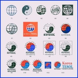
The TESOL Logo
To consummately understand the evolution of the KOTESOL logo, we need to go back to pre-KOTESOL days – to the days of two English language teacher organizations that preceded KOTESOL: TESOL International Association (TESOL) and The Association of English Teachers in Korea (AETK). For many years, until its recent change in logos, TESOL’s logo was a black-and-white circle with latitudinal and longitudinal lines to represent a globe and “TESOL” written across its equatorial center (see T1 above). We will be connecting back to this soon.
The AETK Logo
In 1982, AETK was formed by a group of mainly expat English teachers residing in Seoul. From their beginning, they produced a newsletter, spartan by today’s standards at six typed and mimeographed pages stapled together as their main means of communication. That newsletter contained a logo of sorts: a rough drawing of the Korean peninsula with the name of the association written across the peninsula. What does this have to do with TESOL? Nothing much, except that AETK became the Korean affiliate of TESOL from its beginnings.
By 1985, the newsletter had changed its name to AETK News, and its “logo” had also changed: Its masthead consisted of a row of ten yin-yang symbols (see A1) with “AETK News” written across the middle symbols or with the yin-yang symbols as bookends to the newsletter title. In 1986, the newsletter changed to what I consider to be a bona fide logo. This logo contained elements of both the TESOL logo of the times and the earlier yin-yang symbol of the AETK News. It was circular, contained latitudinal and longitudinal lines similar to those of the TESOL logo, and incorporated a yin-yang symbol mirroring that of the Korean national flag, the taegeuk, but appearing in white and black rather than red and blue (see A2). When the newsletter changed its name to the AETK Bulletin in 1987, its logo, however, remained the same.
In 1990, however, the newsletter’s name again changed, its third name in AETK’s ten-year history: AETK Newsletter. With this name change came a new logo. The circular globe with latitudinal/longitudinal lines more similar to the TESOL logo were incorporated, the white and black of the taegeuk became white and gray, and “AETK” appeared across the equatorial line, again similar to the TESOL logo (see A3). In the last year of the AETK newsletter, there was no name change, only a logo change. The new logo had no lettering on it, the teageuk again became black and white, and the parallels and meridians became thicker, reminiscent of the A2 logo. This logo always appeared with a square, black background and a white circle around the globe (see A4). Though 1992 was the end of AETK, it was not the end of the AETK logo.
The KOTESOL Logo
As 1992 neared an end, AETK and a smaller, nascent KATE (Korean Association of Teachers of English), centered in Daejeon, decided at their joint conference in the autumn to merge. By the spring of 1993, their union had been consummated. With the birth of Korea TESOL (KOTESOL) came the emergence of a new and singular publication: Language Teaching: The Korea TESOL Journal, a newsletter-cum-ELT magazine. (Why are we talking about logos almost exclusively in relation to organizations’ newsletters? In Korea at that time, newsletters were the main publication of these organizations and the main place for their logos to appear.) Perched on the cover of this new organization’s brand-new publication was a new but not-so-unfamiliar logo.
Its orb contained horizontal and vertical lines more closely resembling those of the TESOL logo (T1). Its taegeuk borrowed the white-and-gray color scheme of A3, and it contained no lettering, as with A2 and A4 (see K1). K1 continued to appear in the newsletter-journal through 1995, but that period also saw an anomaly on the cover of the KOTESOL second annual conference book. That cover was the first to be printed in color, and the K2 logo appeared near the bottom. Its lines were white, including the line outlining the taegeuk, but unlike the taegeuk, the red and blue were separated by the central horizontal line. Under the globe, “KOREA TESOL” appeared in white letters against the reddish cover background.
Publications faltered in the 1996 and early-1997 period. In the few publications that were produced during that time, the K3 and K4 logos could sometimes be found. Both had “KOREA TESOL” wrapping around the top part of the globe with dots between the lettering, and both had “KOTESOL” under the globe, appearing as a supporting base. K3 contained a horizontal line between the globe and the lettering below, but K4 did not. While K3 was black and white, the globe of K4 was red and blue, maintaining the color patterning of the taegeuk. The use of a logo in branding during this period appears to not have been considered to be of much import. The 100-page 1996 conference book, for instance, did not contain a single KOTESOL logo, and the only logo to crop up was that in the very last newsletter-journal (early 1997) a very close likeness to the A4 AETK logo used as a cover design! This was most likely due in large part to its editor, Dwight Strawn, who had been involved in publications back in his earlier AETK days.
With new officers taking over in late 1997, renewed emphasis was placed on KOTESOL publications. The English Connection (TEC) emerged as the association’s bimonthly newsletter, and KOTESOL Proceedings 1997 appeared at the end of the year. Late in the following year, the Korea TESOL Journal made its appearance. This surge in publications created opportunities for increased use of an organizational logo. Increased concern about the KOTESOL logo appears to have lead to blending and refinement of the K3 and K5 logos to create a suite of new logos for the 1997–2005 period. The basic logo came in both black-and-white and red-and-blue globe versions. “KOREA TESOL” was wrapped around the outside of the top half of the globe with dots still appearing between each letter, including between the two words “KOREA” and “TESOL.” A globe-width line appeared under the globe with “KOTESOL” appearing under the line (see K5). An alternate version of these basic logo versions were ones with the KOTESOL internet address across the bottom of both the colored and B&W versions (see K6). Another alternate version of the logo at this time was the same as K6 but with a square border around it and the internet address appearing in the bottom part of the border. This also had both colored and B&W versions (see K7 and K8). The increase in KOTESOL publications and other printed materials as well as an increased KOTESOL presence on the internet translated into a much wider use of the KOTESOL logo and a much wider viewing audience.
This author never really cared much for the dots appearing between the letters that circled around the top half of the logo’s globe. They were decorative but not really aesthetic; they were distracting, lowering readability, in my opinion. So in 2005, I brought before the National Council my concern that a revised logo was needed and was tasked with bringing before the Council logo drafts for consideration. I created drafts with the dots removed, with “Korea TESOL” appearing under the line, in one line and also as two, etc. In the end, the design that was settled on was the one with the dots removed. It could appear in all-English (see K10), as was always the case in the past, and alternatively with the Korean name of the organization appearing in Korean script (대한영어교육학회) at the very bottom, as in K9.
As chapters increased their use of printed materials and their presence on the internet, some felt the need for a chapter logo. These logos were variants of the national logo, often with the chapter name replacing “Korea TESOL” at the top or replacing “KOTESOL” at the bottom. For conformity, it was decided that chapters could place their name at the bottom, under “KOTESOL,” as depicted in K11.
The logo in K12 is included here not because it was ever approved by national KOTESOL, but rather because of its widespread use by those thinking it was an authorized KOTESOL logo. The logo originally appeared on printed matter that contained a dark blue background. In order for the black lettering of the colored logo (K10) to be readable, this was changed to white. Fine. However, this logo was later lifted from the printed matter it appeared on and cropped into a square (as in K12) for use elsewhere. Others, mainly at the chapter level, assumed that this was an approved logo and continued to use it in their printed materials. This logo with a blue square was never approved as an official logo, though it did enjoy a period in the spotlight.
The increased use of the internet for communications and promotion created a need for another logo. Height is often the restricted dimension for graphics, so for logos appearing in a row, those that are wider than high are allowed much more space than those that are taller than wide, such as K10. Other organizations’ landscape-oriented logos appearing so much larger beside KOTESOL’s portrait-oriented one, bothered me. I again brought up my logo concerns at a Council meeting and was again tasked with creating new logo drafts. The drafts were basically text (Korea TESOL) appearing to the right of the existing logo (K10), with the Korean name of KOTESOL under a separate line level with that of the K10 logo. I thought it was important to preserve the integrity of the K10 logo by separating the two lines, but the Council’s opinion was to connect them to form a single line. The resulting appearance is one that I am quite happy with (see K13). This logo is now available with “Korea TESOL” in red and blue (K13), in all black, with both white and transparent backgrounds, and in an all-white version for dark backgrounds. The landscape-oriented logo does not replace the K9–K11 versions; it is an additional resource in the current KOTESOL logo collection.
This is the story of the evolution of the KOTESOL logo. A constant has been the inclusion of some form of a globe throughout its development, signifying that KOTESOL is international in its reach, in its activities, and in its membership.
____________
The Author
David Shaffer, PhD, has been a member of KOTESOL since its very early days. Of his years in Korea, he spent four decades as a professor at Chosun University. Now retired from the university, he has more time to devote to KOTESOL, where he is currently Publications Committee chair and a director on the International Conference team. Dr. Shaffer divides the remainder of his time between serving on the executive council of AsiaTEFL and his duties at the Gwangju International Center, where he is editor-in-chief of the Gwangju News monthly magazine.
(Illustration by the author)
